A new brand for QBE
I arrived at QBE to discover that there was no centralized brand, no brand hierarchy and very little that connected the 8 business units together visually. We had clients who were serviced by different business units, specialists in one category of insurance but as there was no centralized brand each unit did their own thing in terms of the representation of themselves rather than an overall presence supporting the individual specialist.
This had to change. In summary the situation was a serious waste of money, effort and did not provide the client with an overall understanding of the size of the organization they were dealing with nor the expertise. Importantly when I did the staff focus groups I discovered that staff were embarrassed by the way the company looked and the tools that they had to represent the work they were doing.
The average age of staff was 29 and so there was an emotional divide. The senior management did not understand the need for the brand to visually appealing, yet the younger people wanted to belong to a vibrant company, a company that was modern, able and outstanding in the field. The senior management did not have the skills to see how this was playing out in the day to day running of the business.
Another important consideration was the largest sponsorship that the company managed, The Sydney Swans. The recall within the advertising was virtually non-existent. The general Swans membership really did not know who QBE was or what it did, even if they knew the name was associated with the Sydney Swans.
The brand had such a poor profile that the Australian Financial Review actually printed the logo in the Swans red colour because they just didn’t know and didn’t seem to think that we cared too much. And certain managers thought it was funny at the time. Clearly I walked into a green fields site.
So lots of discussions, meetings, focus groups, management meetings, with both internal and external parties including our sponsorship arrangement gave me a real understanding of the emotion connections to the present brand, ways to leverage visually what the organization needed to satisfy the daily running of the business, the vision for the brand overall. As an international organization there was much to consider and QBE had a very lean approach to marketing at the time. Frank O’Halloran was quite specific in his instruction to me, “Don’t spend any money.”
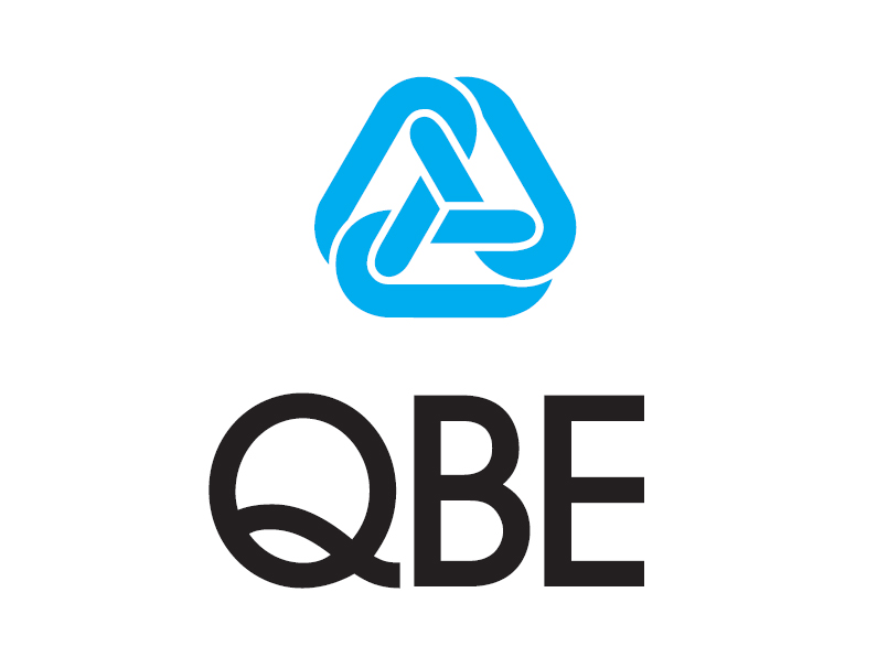
The first piece was the changing of the logo. It was resized against the QBE letters and repositioned. It might not sound like much but proportion are critical when you are building a logo that must work on television, in print, on bill boards, signage, uniforms, application forms, computer systems and be visually recognizable.
Each business unit was so used to running its own race that the need to differentiate each one was going to be an important layer in the way the brand would work. Each General Manager was adamant that they were unique and from my perspective I wanted clients to understand that they were dealing with another arm of QBE by the differentiation of business unit colours. So we selected 12 different colours and created every element that was needed within the running of the business. There were business units leaders and their teams that loved their colour and were proud if not eager to use it. There were others who really didn’t get it but their staff did and importantly the clients definitely did. The level of confidence when dealing with different units that all stood together as a brand family was the best outcome.